
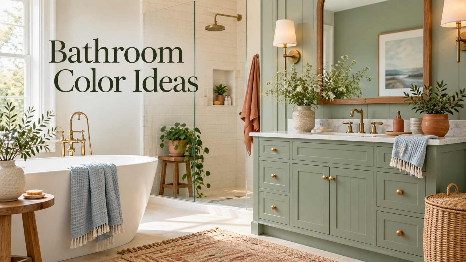
The right bathroom color ideas can change the way a room feels without moving a single fixture. A warm white can soften a bathroom that feels stark, while a deep green can bring character to plain tile and simple cabinetry. You don’t have to repaint every wall, either. Color can come from a vanity, a shower curtain, patterned tile, towels, or even a small painted ceiling.
The best palette depends on the room’s light, the materials you already have, and the mood you want to create. These combinations and practical tips can help you choose colors that feel right in your home—and still look good after the first impression wears off.
Part 1: How to Choose & Plan Your Color Palette
How to Choose a Bathroom Color Palette
Before picking up a paintbrush, look at what’s staying. Tile, countertops, flooring, tubs, and shower surrounds often have undertones that influence which paint colors will work. A creamy tile may make a cool gray wall look blue, for example, while a floor with beige tones may feel out of place next to an icy white.
Take a sample of your tile or countertop to the paint store or compare paint swatches at home. Look at them beside the fixed materials in both daylight and evening light. Bathroom lighting can change color noticeably in a room without a window.
It also helps to decide how you want the room to feel. Do you want it to feel bright and clean, warm and relaxed, dramatic, or a little playful? You don’t need to follow a strict design rule, but having a general direction makes it easier to narrow down choices.
Part 2: 15 Inspiring Bathroom Color Ideas & Combinations
1. White and Natural Wood
White is a bathroom classic, but the right white matters. Warm white has a cream or beige undertone that can feel more welcoming than a bright, cool white. Pair it with natural wood shelves, a wood-framed mirror, or a vanity in an oak finish to add texture.
This palette works well when the room already has white fixtures. The wood keeps everything from feeling too uniform, while white walls help reflect light. If you want a little contrast, try black or bronze hardware.
For a cohesive result, compare the wall paint with the color of the tub and sink. If the fixtures are a cool white, a very creamy wall color may look yellow beside them. A balanced soft white may be a better match.
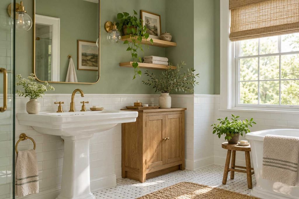
2. Soft Sage Green
Sage green brings a hint of color without overwhelming a small room. It works with tile, warm wood, brass, black, or brushed nickel. Depending on the light, sage can look gray-green, silvery, or more herbal, so test a sample before committing to the whole room.
Try sage on the vanity if you want color without painting all four walls. A green vanity against light walls gives the room a focal point, and it’s easy to coordinate with towels or a bath mat. For a more enveloping look, paint the walls and keep the fixtures and trim simple.
Plants can complement the palette, though they aren’t required. A framed botanical print or a green glass soap dispenser can bring the same natural feeling with less upkeep.
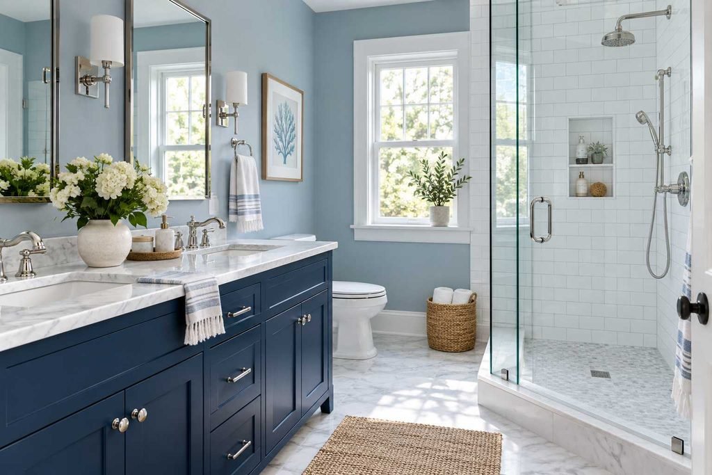
3. Blue and White
Blue can feel fresh and familiar in a bathroom. Pale blue and white make an airy combination, while navy and white have more contrast and a traditional feel. A blue-and-white palette works well with white subway tile, marble-look surfaces, or simple shaker-style cabinets.
If the room is small, you might use blue on the vanity or in the accessories instead of covering every wall. In a larger bathroom, a muted blue wall color can feel calm without looking cold, especially when paired with warm metal finishes or wood.
Pay attention to the undertone. A blue with a gray cast can look dull in a dim room, while a brighter blue may feel more energetic. Hold swatches beside the tile to see how they work together.
4. Beige, Taupe, and Cream
A neutral bathroom doesn’t have to look plain. Beige, taupe, and cream create a backdrop that can make a bathroom feel relaxed and settled. The key is to combine different textures and shades rather than using one flat color everywhere.
For instance, you could pair cream walls with a taupe vanity, textured ivory towels, and a stone-look floor. A wood stool or woven basket adds another layer. Even small differences in finish—matte paint, glossy tile, and soft cotton—help the room feel more considered.
This is a great palette if you want the bathroom to coordinate with the rest of your home. It can also be easier to update over time: change the towels or mirror, and the overall look can shift without a full renovation.
5. Charcoal and Soft White
Charcoal gives a bathroom a crisp, modern edge. Use it on a vanity, a feature wall, or a smaller area such as the wall behind the mirror. Pairing charcoal with white keeps the contrast clear without making the room feel too stark.
In a windowless bathroom, an all-charcoal scheme may feel heavy unless the lighting is strong. Consider limiting the dark color to the lower half of the room or using it on cabinetry. A mirror with good lighting can also help keep the space functional.
Black and charcoal show water marks and dust differently from lighter colors, so consider how much cleaning you want to do. A deep shade may be worth it for the look, but it’s good to know how it behaves before putting it on every surface.
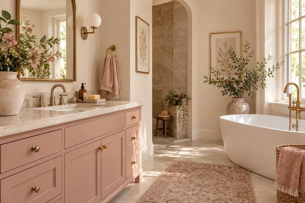
6. Dusty Rose and Warm Neutrals
Dusty rose can add softness and personality without making a bathroom feel overly sweet. It pairs naturally with cream, beige, warm gray, and brushed brass. If you’re unsure about using pink on the walls, start with a vanity, towels, or a small piece of art.
Muted shades usually have more staying power than very bright pinks. A dusty rose with a brown or gray undertone can feel calm and grown-up. Keep the rest of the palette simple so the color has room to stand out.
This combination can be especially nice in a powder room, where a small amount of color can make the space memorable. A round mirror and warm lighting can bring out the softer tones.
7. Terracotta and Cream
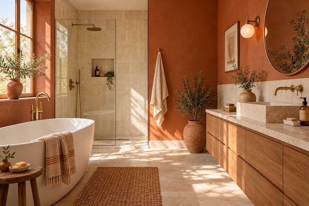
Terracotta adds a sun-warmed, earthy feel. It can work with cream walls, natural wood, white fixtures, or handmade-look tile. Because it’s a bold color, many bathrooms benefit from using terracotta as an accent rather than painting every surface.
A terracotta-colored vanity, a patterned floor, or a few accessories can provide warmth without closing in the room. If you do want terracotta walls, look for a muted shade and check it in different lighting. Some versions lean orange, while others have a clay-like red-brown tone.
Natural materials suit this palette best. A wood stool, a woven basket, or a simple stone tray can add texture without competing with the color.
8. Pale Gray With Warm Accents
Gray can be a practical choice when you want a quiet backdrop, but its undertone makes a big difference. Cool gray can feel crisp beside tile, while warmer gray can sit comfortably with beige flooring and wood. If the room already has warm finishes, a very blue-gray wall may look disconnected.
Rather than choosing the palest gray you can find, try several samples on the wall. Some white-grays can appear lavender, green, or blue in particular lighting. A sample board lets you move the color around the room and see how it changes.
To keep gray from feeling flat, add warmth through lighting, towels, wood details, or brass hardware. Small contrasts make the palette feel more inviting.
9. Green and Black
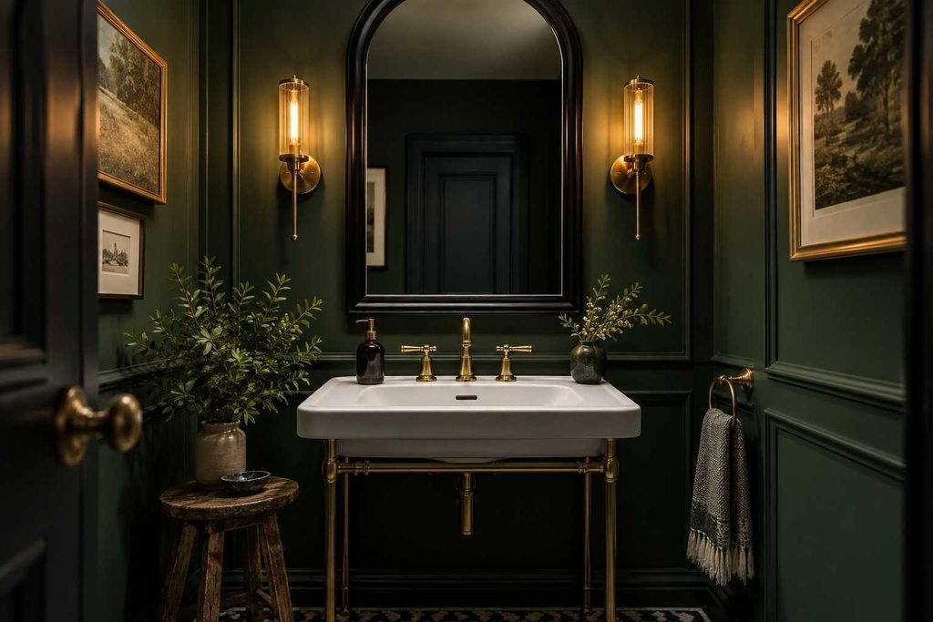
For a dramatic look, pair a deep green with black accents. The green can go on the vanity, the walls, or both, depending on the size and light in the room. Black-framed mirrors, lighting, and hardware bring definition to the palette.
Forest and olive greens work well with white, cream, or natural wood. If the bathroom has limited daylight, choose a green that doesn’t look too dark on the sample. A lighter green may keep the natural feeling while reflecting more light.
This palette doesn’t need many decorative items. A simple mirror, a few towels, and one or two useful accessories are often enough.
10. Blue-Green and Sand
Blue-green—sometimes called teal or turquoise—can make a bathroom feel lively but still restful. Pair it with sandy beige, warm white, or light wood to soften the color. The combination can suggest a coastal mood without relying on shells or nautical decor.
A blue-green tile backsplash or vanity is a manageable way to introduce the shade. If you choose it for the walls, use calmer colors in the rest of the room. Too many competing blues can make the palette look unplanned.
This is one of those bathroom color ideas that works well when you want a noticeable shift but still prefer colors found in nature.
11. A Moody Powder Room
A powder room is a great place to try a color you might hesitate to use in a larger bathroom. Deep plum, inky blue, dark green, and warm brown can make a small room feel distinctive. Since guests usually spend less time there than in a full bathroom, a bolder choice can be fun without changing the feel of your whole home.
Strong color works best when the basics stay simple and easy to use. Keep the mirror well-lit, make sure the paint finish is right for a bathroom, and avoid putting decor where it gets in the way. A patterned wallpaper can also create a focal point without covering every wall in a dark shade.
If the room has no natural light, check paint samples with the light bulbs you plan to use. A color that looks rich in a store may look nearly black under weak lighting.
12. Add Color Through Tile
Paint isn’t the only way to use color. Tile can bring in a pattern or accent shade that lasts longer and is easier to wipe clean in wet areas. A colored floor, ashower stripe, or a tiled backsplash behind the sink can give the room a clear focal point.
If you’re choosing new tile, bring home samples and view them beside the vanity, countertop, and paint. Small chips can be misleading; if possible, borrow a larger sample or see a full installation. The grout color also affects the look: matching grout makes a surface feel more continuous, while contrasting grout highlights the tile pattern.
If the tile is already fixed, use it as a starting point for paint and accessories. Bathroom color ideas are easier to pull together when they respond to the materials already in the room.
13. Try Two-Tone Walls
Painting the lower portion of a wall a different shade can add depth and help a room feel finished. A darker lower wall with a lighter upper section is a familiar choice, but it isn’t the only option. You could use a soft green below and warm white above, or keep the wall neutral and add color with painted trim.
A chair rail can create a natural dividing line, though you can also use tile or a measured paint line. The division doesn’t need to sit halfway up the wall—in many rooms, placing it around the lower third feels balanced.
Two-tone color is a great way to use a stronger shade without letting it take over. It can also visually connect a painted vanity with the wall.
14. Don’t Forget the Ceiling and Trim
The ceiling and trim are easy to overlook, but they heavily influence the room’s overall feel. A soft ceiling color can make a small bathroom feel more complete. In a powder room, carrying a wall color onto the ceiling can create a cozy, wrapped-in look.
White trim gives a clean edge, but it isn’t the only option. Trim painted the same color as the wall can make the room feel calmer, while a slightly darker trim adds definition. If the bathroom has detailed molding or older woodwork, consider whether you want it to stand out or blend in.
Use a paint finish suited to the surface and bathroom conditions. Check the product label and follow the manufacturer’s advice for ventilation and surface preparation.
15. Use Towels and Accessories to Test a Color
If you’re not ready to paint, start with towels, a shower curtain, or a bath mat. These items are easy to switch and can help you see whether a color works with the tile and lighting. A few accents can make a neutral room feel more personal.
Try choosing one accent color and repeating it in two or three places. For example, a sage towel, a small piece of art, and a soap dispenser can feel coordinated without looking overly matched. If you like changing your decor by season, keep finishes neutral and rotate accessories.
This approach is also useful if your bathroom is shared. You can introduce color without making a permanent design decision that everyone has to live with.
Part 3: Mistakes to Avoid & Practical Tips
Bathroom Color Mistakes to Avoid
Choosing color is easier when you know what commonly goes wrong. A few small checks can save you from repainting later:
- Skipping samples: Paint changes under different lighting. Test large swatches on more than one wall.
- Ignoring undertones: Compare paint with the tile, countertop, and flooring, not just with a phone photo.
- Using too many accent colors: A simple palette is easier to coordinate. Choose one or two main shades.
- Choosing color from a screen: Digital images can distort the actual shade. Always use a physical paint sample.
- Forgetting bulbs and fixtures: Warm or cool bulbs can change how the walls look. Check the palette under the lighting you’ll actually use.
- Painting damp or poorly prepared walls: Clean and dry all surfaces and follow product directions, especially in areas exposed to high moisture.
Part 4: Frequently Asked Questions
What colors make a small bathroom look bigger?
Light colors such as warm white, pale blue, soft sage, and light beige can help a bathroom feel open, especially when the room has good lighting. A large mirror and uncluttered surfaces can also make the space feel less crowded.
What is the most relaxing color for a bathroom?
Muted greens, soft blues, warm neutrals, and gentle grays are popular choices for a restful bathroom. The most relaxing option depends on your home’s light and the shades you enjoy seeing every day.
Should bathroom walls and vanity be the same color?
They can be, but they don’t have to be. Painting the vanity a different shade can create a clear focal point. If the room is small, using a similar color on the walls and vanity can make the space feel more continuous and open.
What colors work with white bathroom tile?
White tile pairs with virtually any color. Warm white, green, blue, charcoal, beige, and dusty rose can all work. Use the tile’s undertone as a guide: a warmer white tile may sit best beside creamier shades, while a crisp white tile can pair well with cooler colors.
Is gray still a good bathroom color?
Yes. Gray remains a useful neutral, but choose its undertone carefully. A warm gray works with beige and wood, while a cooler gray may suit crisp white tile and modern finishes. Testing a sample in the room helps you avoid a shade that looks too blue or flat.
How many colors should a bathroom use?
There’s no fixed number, but a simple palette of two or three main colors is usually easy to coordinate. You can add variation through materials and texture—such as wood, tile, metal, and fabric—without introducing competing paint shades.
Conclusion
The most successful bathroom color ideas take the existing room into account. Start with the fixed finishes, check how natural and artificial light affect the space, and choose a palette that suits the way you want the room to feel. If you’re unsure, try testing color on the vanity, towels, or a single feature wall before committing to a complete repaint.
A fresh bathroom doesn’t require a total remodel. Thoughtful paint, a well-chosen accent, or a simple update in textiles can make the room feel more welcoming and uniquely yours.
2 thoughts on “Bathroom Color Ideas: 25 Ways to Create a Fresh, Inviting Space”