

A bedroom should help you slow down at the end of the day, and the walls have a bigger part in that feeling than you might expect. The right wallpaper for bedroom walls can add softness, depth, or personality without requiring a full room makeover. From quiet textures to expressive florals, there is a design for nearly every space, taste, and budget. The key is to choose a pattern that works with your light, furniture, and daily routine instead of judging it on a sample alone.
1. Start with the mood you want
Before comparing colors or patterns, decide how you want the room to feel. A bedroom used mainly for rest may call for gentle colors and a low-contrast print. If you enjoy a more expressive look, a bolder design can bring energy to the room while still feeling comfortable. Think about how you want the space to feel when you wake up, read, or switch off the lights.
Try describing your goal in a few words: calm and airy, warm and cozy, fresh and romantic, or modern and graphic. These words become a useful filter as you look at samples. “Calm and airy” might point you toward pale botanicals or a fine linen texture. “Warm and cozy” could lead you to deeper greens, rust, or a small-scale pattern with a soft finish.
Your inspiration does not have to come from a decorating trend. A favorite landscape, piece of art, or quilt can be a good starting point. You do not need to repeat its colors exactly. A design that shares one or two tones with something you already love can help the room feel connected.
2. Decide where to use the pattern
A feature wall behind the bed is a natural place to begin. It gives the room a focal point and leaves the other walls quieter, which can be helpful if the pattern is large or high contrast. Centering the design behind the headboard also helps it look intentional.
The bed wall is not the only option. In a long, narrow room, papering the far wall can draw the eye forward. In a room with a beautiful window, a patterned wall beside it can add interest without competing with the view. A reading nook, dressing corner, or shallow alcove can also be a good place for a special print.
Covering all four walls can look polished when the design is subtle or the room is spacious. A small repeat, grasscloth effect, or softly blended color can read almost like texture from across the room. A dramatic print can create a jewel-box feeling, too, but balance it with simple bedding, restrained artwork, and uncluttered surfaces.
Tape a large sample to the wall before deciding. Look at it from the doorway and from the bed. Notice how it changes in morning light, afternoon light, and lamplight. A sample held in your hand can seem much smaller and brighter than the pattern will look across a whole wall.

3. Match the pattern scale to the room
Pattern scale affects how a wall feels. Large motifs can make a room look confident and curated, but they need enough visual space to be appreciated. In a small room, an oversized print can still work if the colors are gentle and the furniture is simple. Try not to combine it with several competing patterns.
Small repeats often feel delicate and blend into the background from a distance. They are useful when you want interest without a strong focal point. Medium-scale patterns provide a comfortable middle ground: visible enough to give the room character, but easy to combine with plain bedding or a simple rug.
Look at the pattern repeat, which tells you how far the design travels before it starts again. A large repeat can require more rolls because the installer must line up the design between strips. Order enough material for matching, cutting, and possible future repairs. A supplier’s calculator can help, but confirm your measurements and the specific product instructions before buying.
Do not judge a print only by its online thumbnail. Ask for a sample that shows a complete section of the repeat. Place it near your headboard, curtains, flooring, and trim. The same color can look quite different beside warm wood than it does beside cool gray paint.
4. Use color to connect the room
A coordinated bedroom does not need every item to match. Instead, let the wall design introduce a small palette that you can repeat in a few places. If it includes muted blue, for example, you might echo that tone in a cushion, a ceramic lamp, or a throw. Repeating one color a few times is often enough to make the scheme feel considered.
Neutrals are popular because they work with many furniture styles. Cream, sand, taupe, and warm gray can add texture without making the room feel busy. If the rest of the room is already neutral, a wallpaper for bedroom accent wall in sage, dusty rose, navy, or terracotta can add definition without taking over.
Pay attention to undertones. A cool gray wall may clash with creamy bedding, while warm beige can make a bright white room feel more welcoming. Put samples next to the materials you plan to keep. Check them in daylight and under your evening lights; warm bulbs can shift greens and blues, while cool bulbs can flatten warm colors.
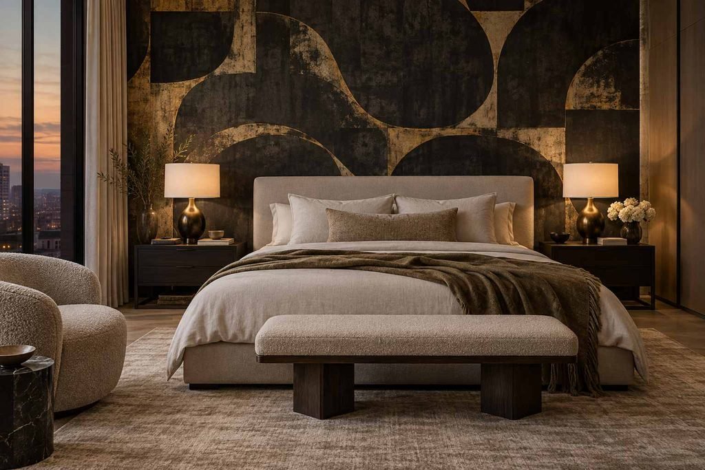
Dark colors deserve a fair look, too. Deep charcoal, forest green, or inky blue can make a bedroom feel restful and intimate, especially when paired with layered lighting and pale bedding. Rather than assuming a dark design will shrink the room, consider how it might anchor the bed and make the edges of the room less noticeable.
5. Explore styles that suit different bedrooms
Botanical and floral prints
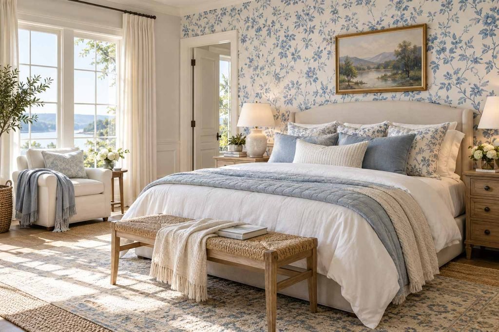
Leaves, branches, and flowers can bring a gentle connection to nature. For a modern room, look for simplified shapes, generous open space, or a limited color palette. Traditional florals can feel relaxed when paired with plain linen, natural wood, and a few contemporary accents.
Geometric and abstract designs
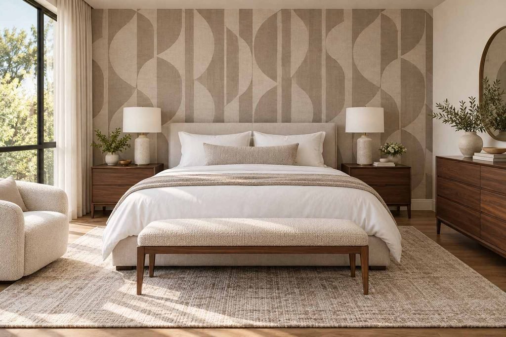
Lines, arches, checks, and loose abstract forms can give a bedroom a clean, modern character. A low-contrast geometric print feels orderly and subtle, while a larger abstract design can create a statement behind the headboard. Keep the rest of the room’s patterns simple so the wall remains easy to live with.
Textured and natural-look finishes
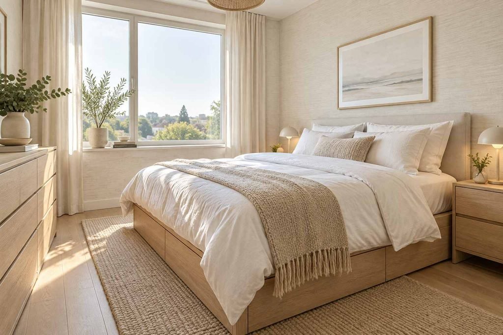
Grasscloth-inspired designs, brushed effects, and faux linen prints add depth without a strong motif. They are a good choice when you want the wall to feel finished but do not want a noticeable pattern. Real natural-fiber coverings have unique texture and variation, so ask how they handle cleaning and sunlight before choosing them.
Stripes and small repeats
Vertical stripes can make a low ceiling feel a little taller, while horizontal bands may emphasize the width of a wall. The effect is subtle, so do not expect stripes to change the room’s proportions dramatically. Tiny dots, checks, and repeating motifs provide a versatile backdrop for primary bedrooms, guest rooms, and children’s bedrooms.
6. Consider the room’s size and architecture
The shape of the room matters as much as its floor area. A bedroom with sloped ceilings, a chimney breast, or built-in wardrobes may have several short wall sections. A large repeating design can be harder to position around those interruptions, so measure each surface and consider where the most visible part of the pattern will land.
In compact bedrooms, a light background can help the space feel open, but light colors are not a strict rule. Deep colors can be inviting in a small room when the pattern is not overly busy and the lighting is good. Mirrors, pale bedding, and clear floor space can balance a dramatic wall.
In a large bedroom, a small print may disappear unless the color contrast is strong. You can choose a larger motif, use the design on more than one wall, or bring in texture through lampshades, curtains, and rugs. Think about what you see from the bed: a pattern that looks beautiful at the doorway should also feel comfortable up close.
If the room has low ceilings, take the design up to the ceiling line and avoid a strong horizontal border that visually lowers the wall. For tall rooms, a deliberate picture rail or color break can make the space feel more intimate. These are visual effects, not structural changes, so let comfort guide your choice.
7. Pick a material that fits your life
Wallpaper comes in several constructions, and the right choice depends on the room and the product. Non-woven options are often designed for easier hanging and removal, while traditional paper may require paste to be applied in a particular way. Peel-and-stick products can be convenient for renters or temporary updates, but results depend on wall smoothness, paint condition, and the manufacturer’s instructions.
A bedroom is usually a lower-splash area than a kitchen or bathroom, but it still needs care. Check whether the surface is washable, wipeable, or best cleaned with a dry cloth. If you have children, pets, or frequently move furniture, a more durable finish may be worth considering. Keep leftover material labeled and stored flat or in its original packaging for later repairs.
Wall preparation is essential. The surface should be clean, dry, smooth, and sound. Old wallpaper, loose paint, and visible wall defects can show through or affect adhesion. Some surfaces need primer or lining paper, so follow the product’s installation guide. If hiring an installer, ask how they handle seams, corners, pattern matching, and repairs.
8. Coordinate furniture, bedding, and lighting
Once you choose a wall design, let it guide the supporting pieces without dictating every detail. If the print has several colors, pick one to repeat in a cushion or artwork and keep larger pieces relatively simple. If the pattern is quiet, introduce texture through a quilt, woven rug, or upholstered headboard.
The bed often covers part of the wall, so check how the design will appear around the headboard. A tall headboard may hide the most interesting part of a small repeat. For a mural or large botanical motif, position the main shape so it does not disappear behind the bed or fall awkwardly at the edge of a wall.
Lighting can change how a pattern reads. A pendant or bedside lamp creates pools of warm light that may deepen colors at night. If the design has a metallic or textured finish, side lighting can reveal its surface; direct glare may also make it look shinier than expected. Test samples next to the actual lamps before making a decision.
Keep artwork selective. A busy print and a gallery wall can compete, but one framed piece in a complementary color may look excellent. If you prefer a clean look, let the walls carry the visual interest and use mirrors or simple sconces instead of multiple frames.
9. Avoid common decorating missteps
One common mistake is choosing a print before considering the rest of the room. A beautiful sample may not work with existing flooring, curtains, or a favorite piece of furniture. Gather fabric swatches and paint cards first, then assess them together in the room.
Another mistake is relying on a tiny sample. Pattern, color, and texture all read differently at scale. Order samples and tape them up for several days. If you are torn between two options, take a photo of each on the wall and compare them from across the room.
It is also easy to underestimate how much material you need. Pattern matching can create more waste than a plain design, and extra rolls from a later production batch may not match perfectly. Measure carefully, include the pattern repeat in your calculation, and ask the retailer about return rules for unopened rolls.
Finally, avoid giving every element equal visual weight. A bold wall, patterned duvet, bright rug, and statement curtains can all be appealing on their own, yet tiring together. Pick one main pattern, then let other textures and colors support it. A room should look good in a photograph, but it should also feel restful when you are ready to sleep.
10. Plan the project before you order
Start by writing down what you want to keep: bed, nightstands, curtains, rugs, or artwork. Measure the wall or walls you intend to cover, and note windows, doors, outlets, and built-ins. Decide whether you want one feature wall or a fully papered room. That choice narrows your options and helps you estimate materials.
Next, collect a short list of designs that fit your mood and palette. Request samples and tape them up for several days. Notice whether the print still appeals to you in the evening, when you may use the room most. Ask someone else for an opinion if you like, but base the final decision on how it feels to you.
Set a realistic budget that includes the paper, adhesive if needed, primer, tools, delivery, and labor. Complicated patterns, uneven walls, and many corners can increase installation time. If this is your first project, try a small, less visible area or ask an installer to assess the wall before you purchase.
After installation, follow the care instructions and keep your leftover roll in a dry place. Write down the product name, color, batch, and purchase date. These details are useful if you need an extra roll or want to repair a small damaged section later.
Frequently asked questions
Is wallpaper suitable for a small bedroom?
Yes. A small room can work with subtle texture, a fine repeat, or even a bold feature wall. Focus on the overall balance: keep furniture streamlined, avoid too many competing patterns, and test a sample in the room before ordering. Light colors may feel airy, while darker tones can make the space feel cozy.
Should I cover all four walls?
You can, especially with a soft texture or low-contrast design. Covering every wall creates a unified look, while a single feature wall makes the pattern a focal point. Consider the print scale, natural light, and how much visual activity feels comfortable to you.
Which wall is best for a bedroom feature?
The wall behind the bed is a common choice because it frames the room’s main piece of furniture. A far wall can work well in a narrow room, and a nook or alcove can provide a contained place for a stronger pattern. Choose the surface that looks intentional from the doorway and from the bed.
Can I use peel-and-stick wallpaper in a bedroom?
Often, yes, if the wall is smooth, clean, and compatible with the product. Follow the brand’s instructions for paint curing time, installation, and removal. Test a sample first, since textured walls and some paint finishes can reduce adhesion or make removal difficult.
What pattern helps a bedroom feel calm?
Soft colors, gentle contrast, and patterns with breathing room often create a quieter effect. Botanical shapes, small repeats, and natural-look textures are common choices. Calm is personal, though: some people relax in a simple neutral room, while others prefer deep colors and a more dramatic setting.
How much extra material should I buy?
The amount depends on wall dimensions, the number of doors and windows, and the pattern repeat. A large repeat usually needs more material for matching. Use the manufacturer’s calculator or ask a retailer or installer to check your measurements, and keep a labeled extra piece for future repairs.
How do I keep the room from looking too busy?
Let the walls be the main pattern and use quieter bedding, rugs, and curtains nearby. Repeat one or two colors from the design in small accents, and leave some surfaces visually clear. Mixing textures is fine; using several high-contrast patterns at once can make a room feel restless.
Conclusion
A successful bedroom update starts with a clear idea of how you want the room to feel. Consider wall placement, print scale, color, material, and the furniture you already own. Samples and careful measurements make it easier to imagine the finished result before you commit.
The best wallpaper for bedroom walls is the one that feels right in your real space, in both daylight and lamplight. Take time to compare options, keep the rest of the room in balance, and choose a design you will enjoy seeing each day. With a thoughtful plan, wallpaper can make the bedroom feel more personal, finished, and comfortable without changing everything else.
1 thought on “Wallpaper for bedroom: How to Choose a Style That Feels Like You”